Tet
Rebranding for Latvia's leading tech and entertainment brand as the company aims to expand its reach beyond the local market and compete at an international level.
The largest Latvian telecom was up for a rebranding to expand its reach beyond the local market, compete at an international level, and move away from the notion of a traditional telecom company as its product portfolio expands to entertainment, energy, and technology.
Our team was tasked with designing a new wordmark and visual identity that embodies the brand's DNA, which aims to help make everyday life easier with the help of technology while still allowing us people to be, well, people.
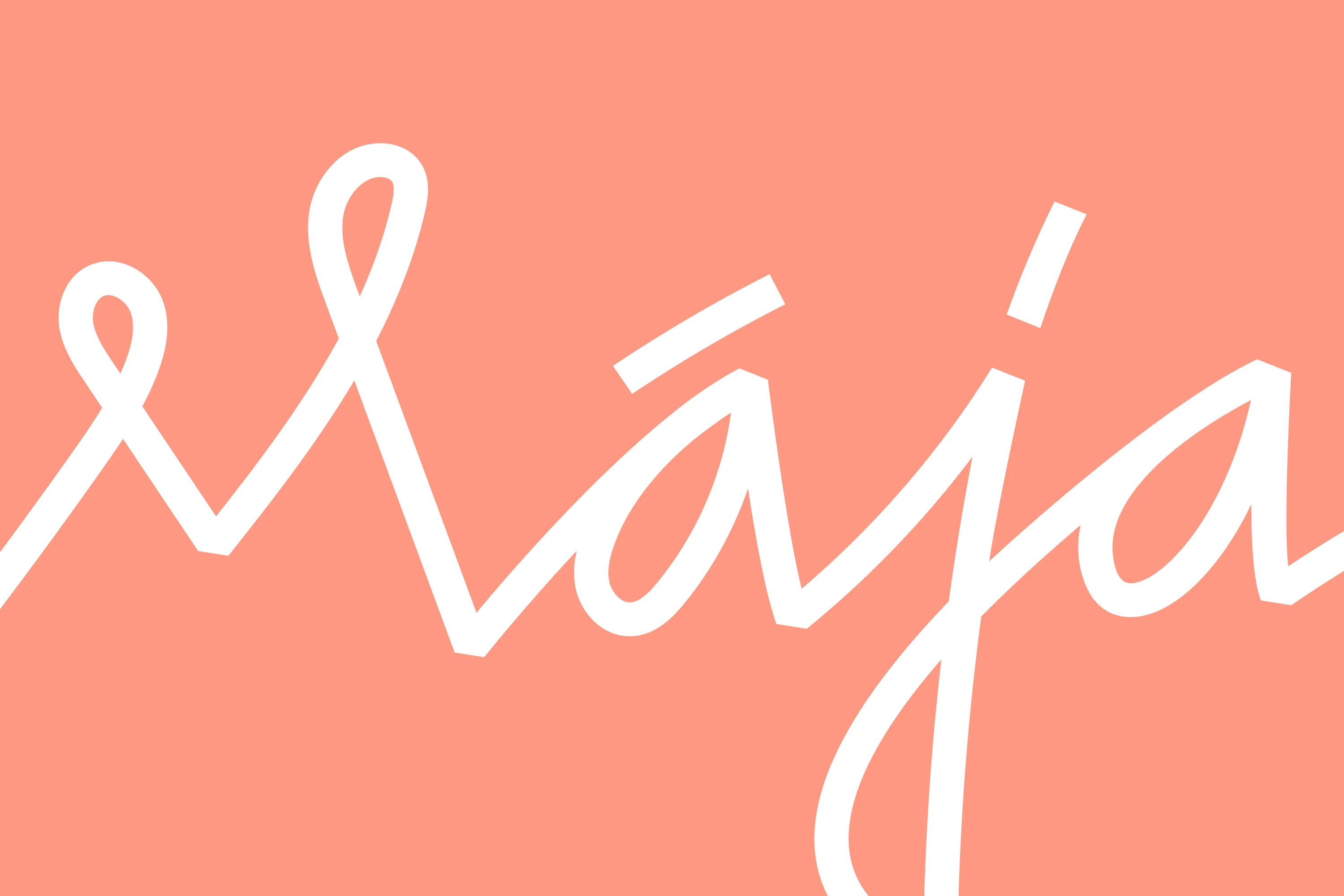
The logo is designed in a flowing, continuous form of lowercase letters resembling handwriting, symbolizing the brand's aim to communicate with its customers in a relatable way.
The visual identity is light, airy, and clean — a reflection of the simplicity and ease that technology can bring to our everyday lives.
"Who hasn't been in a situation where you want to include so much in one design that it looks crazy?
It's helpful to have an expert by your side who can ask the right questions, connect the dots, and reveal how to eliminate the excess."
Ieva Melbarde
Brand Communications Manager
Tet